Create Horizontal Navigation Menu With Drop Down Submenus Using CSS
The following drop down menu is made only with CSS, is a horizontal menu with sub-tabs and the right side has a rounded search. A menu is handy for those who do not require complex menus or prefer not to use one that requires scripts and/or too many images, also the installation and customization is quite simple, and to top it off is quite functional.

Prior to doing anything, if you are using a Template made through Blogger Template Designer, then you should consider doing these changes in the template, otherwise the menu might not be displayed correctly:
From your Blogger's Dashboard, go to Template (make a backup < see the screenshot) > Edit HTML:

and search (CTRL + F) for the following line:
Remove the code in red.
You may have many parts as the one in red, delete all you find.
....then find this section in your template:
...and remove all that is within it, until you reach to the Headings part.
Then add this to where the code has been removed (instead of the code in green):
How To Add Horizontal Drop Down Menu to Blogger
To put this horizontal menu with submenus in your blog, then follow the next steps:
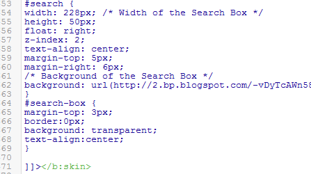
Step 1. From Template, go to Edit HTML and just above ]]></b:skin> paste these styles:

Step 2. Save the Template

Step 3. Go to Layout > click on Add a Gadget link

Step 4. Choose HTML/Javascript and paste the following inside the empty box:
Customization:
- replace the text in blue and red with your links and titles.
- if you need more tabs, then add a line like this just above <!-- Search Bar -->
- if you want to add a tab with sub-tabs, then add this code:
- and if you want one of the other sub-tabs have sub-tabs then remove a line like the one in orange and change it to a code like this:
And that's it! Now Save your Widget and enjoy your new drop down menu! ;)
Prior to doing anything, if you are using a Template made through Blogger Template Designer, then you should consider doing these changes in the template, otherwise the menu might not be displayed correctly:
From your Blogger's Dashboard, go to Template (make a backup < see the screenshot) > Edit HTML:
and search (CTRL + F) for the following line:
<b:section class='tabs' id='crosscol' maxwidgets='1' showaddelement='yes'>
 |
| Screenshot |
Remove the code in red.
You may have many parts as the one in red, delete all you find.
....then find this section in your template:
/* Tabs
----------------------------------------------- */
...and remove all that is within it, until you reach to the Headings part.
/* Tabs
----------------------------------------------- */
.tabs-outer {
overflow: hidden;
position: relative;
background: $(tabs.background.color) $(tabs.background.gradient) repeat scroll 0 0;
}
#layout .tabs-outer {
overflow: visible;
}
.tabs-cap-top, .tabs-cap-bottom {
position: absolute;
width: 100%;
border-top: 1px solid $(tabs.border.color);
}
.tabs-cap-bottom {
bottom: 0;
}
.tabs-inner .widget li a {
display: inline-block;
margin: 0;
padding: .6em 1.5em;
font: $(tabs.font);
color: $(tabs.text.color);
border-top: 1px solid $(tabs.border.color);
border-bottom: 1px solid $(tabs.border.color);
border-$startSide: 1px solid $(tabs.border.color);
}
.tabs-inner .widget li:last-child a {
border-$endSide: 1px solid $(tabs.border.color);
}
.tabs-inner .widget li.selected a, .tabs-inner .widget li a:hover {
background: $(tabs.selected.background.color) $(tabs.background.gradient) repeat-x scroll 0 -100px;
color: $(tabs.selected.text.color);
}
/* Headings
----------------------------------------------- */
Then add this to where the code has been removed (instead of the code in green):
#crosscol ul {z-index: 200; padding:0 !important;}Having done this, we can finally add our menu.
#crosscol li:hover {position:relative;}
#crosscol ul li {padding:0 !important;}
.tabs-outer {z-index:1;}
.tabs .widget ul, .tabs .widget ul {overflow: visible;}
How To Add Horizontal Drop Down Menu to Blogger
To put this horizontal menu with submenus in your blog, then follow the next steps:
Step 1. From Template, go to Edit HTML and just above ]]></b:skin> paste these styles:
/* Horizontal drop down menu
----------------------------------------------- */
#menuWrapper {
width:100%; /* Menu width */
height:35px;
padding-left:14px;
background:#333; /* Background color */
border-radius: 10px;
}
.menu {
padding:0;
margin:0;
list-style:none;
height:35px;
position:relative;
z-index:5;
font-family:arial, verdana, sans-serif;
}
.menu li:hover li a {
background:none;
}
.menu li.top {display:block; float:left;}
.menu li a.top_link {
display:block;
float:left;
height:35px;
line-height:34px;
color:#ccc;
text-decoration:none;
font-family:"Verdana", sans-serif;
font-size:12px; /* Font size */
font-weight:bold;
padding:0 0 0 12px;
cursor:pointer;
}
.menu li a.top_link span {
float:left;
display:block;
padding:0 24px 0 12px;
height:35px;
}
.menu li a.top_link span.down {
float:left;
display:block;
padding:0 24px 0 12px;
height:35px;
}
.menu li a.top_link:hover, .menu li:hover > a.top_link {color:#fff; }
.menu li:hover {position:relative; z-index:2;}
.menu ul,
.menu li:hover ul ul,
.menu li:hover ul li:hover ul ul,
.menu li:hover ul li:hover ul li:hover ul ul,
.menu li:hover ul li:hover ul li:hover ul li:hover ul ul
{position:absolute; left:-9999px; top:-9999px; width:0; height:0; margin:0; padding:0; list-style:none;}
.menu li:hover ul.sub {
left:0;
top:35px;
background:#333; /* Submenu background color */
padding:3px;
white-space:nowrap;
width:200px;
height:auto;
z-index:3;
}
.menu li:hover ul.sub li {
display:block;
height:30px;
position:relative;
float:left;
width:200px;
font-weight:normal;
}
.menu li:hover ul.sub li a{
display:block;
height:30px;
width:200px;
line-height:30px;
text-indent:5px;
color:#ccc;
text-decoration:none;
}
.menu li ul.sub li a.fly {
/* Submenu Background Color */
background:#333 url(https://blogger.googleusercontent.com/img/b/R29vZ2xl/AVvXsEjMlR8ePwLB1vn0HPjxCAl-IgEBxgAb-cImOKzIX09bKQ9eK3rxczIbfoo8CeyOIlmrBE56M4O4xrF17UHC5s1uNbGrWVJ9VROc-50_dCbvyFArDaR0IYS_VYfipObYxEwwpVnb6Tg3UFQ/s1600/arrow_over.gif) 185px 10px no-repeat;}
.menu li:hover ul.sub li a:hover {
background:#515151; /* Background Color on mouseover */
color:#fff;
}
.menu li:hover ul.sub li a.fly:hover, .menu li:hover ul li:hover > a.fly {
/* Background on Mouseover */
background:#646464 url(https://blogger.googleusercontent.com/img/b/R29vZ2xl/AVvXsEjMlR8ePwLB1vn0HPjxCAl-IgEBxgAb-cImOKzIX09bKQ9eK3rxczIbfoo8CeyOIlmrBE56M4O4xrF17UHC5s1uNbGrWVJ9VROc-50_dCbvyFArDaR0IYS_VYfipObYxEwwpVnb6Tg3UFQ/s1600/arrow_over.gif) 185px 10px no-repeat; color:#fff;}
.menu li:hover ul li:hover ul,
.menu li:hover ul li:hover ul li:hover ul,
.menu li:hover ul li:hover ul li:hover ul li:hover ul,
.menu li:hover ul li:hover ul li:hover ul li:hover ul li:hover ul {
left:200px;
top:-4px;
background: #333; /* Background Color of the Submenu */
padding:3px;
white-space:nowrap;
width:200px;
z-index:4;
height:auto;
}
#search {
width: 228px; /* Width of the Search Box */
height: 50px;
float: right;
z-index: 2;
text-align: center;
margin-top: 5px;
margin-right: 6px;
/* Background of the Search Box */
background: url(https://blogger.googleusercontent.com/img/b/R29vZ2xl/AVvXsEgZEtxXdSLNZMOpPVUxtMtHcBQ5WSOZ5-1ENNtCXHUJcKoiM_zemNTJKG4i7NpHlgC1agX0o_W9AQm77R4CFRLmGYouVu75TmqjroPiWsywMWrLQNXIQoYfrFpQ_DS4y5HBTb5mDU5O8Wk/s1600/searchBar1.png) no-repeat;
}
#search-box {
margin-top: 3px;
border:0px;
background: transparent;
text-align:center;
}
 |
| Screenshot |
Step 3. Go to Layout > click on Add a Gadget link
Step 4. Choose HTML/Javascript and paste the following inside the empty box:
<div id='menuWrapper'>
<ul class='menu'>
<li class='top'><a class='top_link' href='Link URL'><span>Title 1</span></a></li>
<li class='top'><a class='top_link' href='Link URL'><span class='down'>Title 2</span></a><ul class='sub'><li><a class='fly' href='Link URL'>Submenu 2.1</a><ul>
<li><a href='Link URL'>Submenu 2.1.1</a></li>
<li><a href='Link URL'>Submenu 2.1.2</a></li>
<li><a href='Link URL'>Submenu 2.1.3</a></li>
</ul>
</li>
<li class='mid'><a class='fly' href='Link URL'>Submenu 2.2</a>
<ul>
<li><a href='Link URL'>Submenu 2.2.1</a></li>
<li><a href='Link URL'>Submenu 2.2.2</a></li>
<li><a href='Link URL'>Submenu 2.2.3</a></li>
<li><a class='fly' href='Link URL'>Submenu 2.2.4</a>
<ul>
<li><a href='Link URL'>Submenu 2.2.4.1</a></li>
<li><a href='Link URL'>Submenu 2.2.4.2</a></li>
<li><a href='Link URL'>Submenu 2.2.4.3</a></li>
</ul>
</li>
<li><a href='Link URL'>Submenu 2.2.5</a></li>
<li><a class='fly' href='Link URL'>Submenu 2.2.6</a>
<ul>
<li><a href='Link URL'>Submenu 2.2.6.1</a></li>
<li><a href='Link URL'>Submenu 2.2.6.2</a></li>
</ul>
</li>
</ul>
</li>
<li><a href='Link URL'>Submenu 2.3</a></li>
<li><a href='Link URL'>Submenu 2.4</a></li>
<li><a href='Link URL'>Submenu 2.5</a></li>
</ul>
</li>
<li class='top'><a class='top_link' href='Link URL'><span class='down'>Title 3</span></a>
<ul class='sub'>
<li><a href='Link URL'>Submenu 3.1</a></li>
<li><a href='Link URL'>Submenu 3.2</a></li>
<li><a href='Link URL'>Submenu 3.3</a></li>
<li><a href='Link URL'>Submenu 3.4</a></li>
</ul>
</li>
<li class='top'><a class='top_link' href='Link URL'><span class='down'>Title 4</span></a>
<ul class='sub'>
<li><a href='Link URL'>Submenu 4.1</a></li>
<li><a class='fly' href='Link URL'>Submenu 4.2</a>
<ul>
<li><a href='Link URL'>Submenu 4.2.1</a></li>
<li><a href='Link URL'>Submenu 4.2.2</a></li>
<li><a href='Link URL'>Submenu 4.2.3</a></li>
<li><a href='Link URL'>Submenu 4.2.4</a></li>
<li><a href='Link URL'>Submenu 4.2.5</a></li>
<li><a href='Link URL'>Submenu 4.2.6</a></li>
</ul>
</li>
<li><a href='Link URL'>Submenu 4.3</a></li>
<li><a href='Link URL'>Submenu 4.4</a></li>
<li><a href='Link URL'>Submenu 4.5</a></li>
<li><a href='Link URL'>Submenu 4.6</a></li>
</ul>
</li>
<li class='top'><a class='top_link' href='Link URL'><span class='down'>Title 5</span></a>
<ul class='sub'>
<li><a href='Link URL'>Submenu 5.1</a></li>
<li><a href='Link URL'>Submenu 5.2</a></li>
<li><a href='Link URL'>Submenu 5.3</a></li>
</ul>
</li>
<!-- Search Bar -->
<li>
<form action='/search' id='search' method='get' name='searchForm' style='display:inline;'>
<input id='search-box' name='q' onblur='if (this.value == "") this.value = "Search here...";' onfocus='if (this.value == "Search here...") this.value = "";' size='28' type='text' value='Search here...'/></form>
</li>
</ul>
</div>
Customization:
- replace the text in blue and red with your links and titles.
- if you need more tabs, then add a line like this just above <!-- Search Bar -->
<li class="top"><a href="Link URL" class="top_link"><span>Title</span></a></li>
- if you want to add a tab with sub-tabs, then add this code:
<li class="top"><a href="Link URL" class="top_link"><span class="down">Title</span></a>
<ul class="sub">
<li><a href="Link URL">Submenu Title</a></li>
<li><a href="Link URL">Submenu Title</a></li>
<li><a href="Link URL">Submenu Title</a></li>
</ul>
</li>
- and if you want one of the other sub-tabs have sub-tabs then remove a line like the one in orange and change it to a code like this:
<li><a href="Link URL" class="fly">Submenu Title</a>
<ul>
<li><a href="Link URL">Other Submenu</a></li>
<li><a href="Link URL">Other Submenu</a></li>
<li><a href="Link URL">Other Submenu</a></li>
</ul>
</li>
And that's it! Now Save your Widget and enjoy your new drop down menu! ;)
Create Horizontal Navigation Menu With Drop Down Submenus Using CSS
 Reviewed by Anonymous J
on
11:33
Rating:
Reviewed by Anonymous J
on
11:33
Rating:
Reviewed by Anonymous J
on
11:33
Rating:
No comments: